What it means to be 'At the heart of Pharma'
Informa Markets colleagues explain the motivations behind CPHI’s rebrand.
CPHI is a well-established leader in the pharma events space, uniting thousands of industry professionals across the world each year. Our goal has been, and continues to be, to create experiences that connect stakeholders from across the supply chain and result in meaningful partnerships.
When the COVID-19 pandemic hit and the world closed down, we knew our brand and offerings needed to evolve to meet the changing needs of our community. Over the next two years, we shifted our value proposition and redefined what it means to be part of CPHI.
Now we’re proud to present a refreshed brand image that reflects our journey. This is how we did it.
The drive towards digital
When the world began to reopen, we realised how much we’d changed as a business over the course of the pandemic. Like a teenager after a rapid growth spurt, one day we looked around and found our trousers hovering awkwardly above our ankles.
The pandemic made maintaining the status quo impossible and, according to Marketing Director Andreas Mavrommatis, forced us to accelerate plans that may otherwise have taken years to implement.
‘We were forced to speed up our evolution as a business - to introduce new business solutions, new products and services and become a 365-networking solutions provider to the pharma industry, something we were not doing before,’ Mavrommatis says.
In May 2020, the first instalment of the CPHI Webinar Series went live. What followed was a digital content blitz – podcasts, videos, trend reports, whitepapers. We built a digital offering that would provide our partners with the leads and engagement they were desperately seeking in the absence of face-to-face networking.
And as our business evolved, we felt that our brand no longer represented the breadth of services and solutions we now offer. Head of Marketing for the pharma portfolio, Natasha Jennings, says it became difficult to tell a ‘consistent story about what we do and the scope of our offering’. Jennings joined the company in March 2021.
‘When I joined Informa, we had grown from a primarily events-orientated brand to more of a digital-orientated brand offering 365 digital engagement solutions as well as hosting the largest global marketplace for pharma professionals looking to source and showcase products and solutions. These digital solutions combined with our event led solutions really support our pharma community and yet this wasn’t quite reflected in our overall brand architecture or messaging. We basically had a different logo and story for everything! Once we started exploring the potential, it kind of clued us onto the fact that we may have to revisit who we are as a brand and the equity we have and how we work with our clients,’ she says.
Simplifying our portfolio
Beyond just highlighting our new digital solutions, we wanted to simplify the story we were telling. As our business expanded over the years, so did the number of partner and co-located brands in our portfolio. The team began to wonder whether the different acronyms, logos and colour schemes associated with each sub-brand actually meant anything to our customers. Did the average event attendee know the difference between ICSE, InnoPack or InformEx? Was each sub-brand recognisable in its own right? And how would all this fragmentation align with our new digital business?
According to Mavrommatis, ‘We were not really creating a story in the brand architecture for our clients that made it easy for them to understand who we are, what we do, what we offer, and what the benefits are. Brand architecture needs to convey a very clear message to your audience. And we didn't have that.’
The team partnered with an external brand agency who’d worked previously with other Informa portfolios and created a plan of action. We knew feedback would be crucial and set about gauging the opinions of partners, customers and Informa colleagues.
Because CPHI has a 32-year history of connecting the pharma community, we knew it was widely recognised and should remain a focal point of the refreshed brand.
Brand Director Orhan Caglayan says: ‘People were using CPHI to define the experience they had. They didn’t investigate the source that much. So CPHI became our umbrella brand which covers all the values, all the strategies, all the ambitions we have and what the market is actually seeing in us. It empowers us to unite everything under one brand’.
While most sub-brands were retired and unified under CPHI, two retain their own distinct presence – Pharmapack and P-MEC. Pharmapack is a packaging and drug delivery event that takes place annually in Paris, France. It has been running for more than 20 years and is considered a ‘boutique’ offering within the portfolio. P-MEC is an event with global reach that focuses on pharmaceutical machinery, equipment, and technology. Both brands have high levels of recognition within the industry and, consequently, will retain their own names with the addition of a ‘by CPHI’ by-line. P-MEC will only retain its branding in India and China, as these are the markets where it is best known.
What it means to be ‘At the heart of Pharma’
A great tagline is something every company should strive for. If done right, it should immediately call to mind the brand and its associations. Iconic examples include Nike’s ‘Just Do It’, McDonalds’ ‘I’m Lovin’ It’ and L’Oréal’s ‘Because You’re Worth It’.
We knew we needed a brand line that highlighted our shift towards digital, while respecting our history and recognising that in-person events remain a core part of our value proposition. And so, ‘At the heart of Pharma’ was born.
‘We’re bringing people together, but actually we are also part of pharma. We’re not only an enabler, but we are really at the heart of it,’ says Caglayan. ‘Now the pharma community gathers around us – not just under a roof that we create - but really around the CPHI brands.’
For Brand Manager Sherma Ellis-Daal, the heart - a vital organ - serves as the perfect analogy for CPHI. ‘We are involved in connecting people and that's what the hearts does. It connects,’ she says.
‘It's a strong function, a strong organ that you need to keep your body alive. And I think that's what CPHI does, it serves its community.’
As well as capturing our own transformation, we wanted CPHI’s customers and partners to be able to relate to our brand line. ‘It definitely came from within the industry,’ says Adam Andersen, Executive Vice President, Pharma.
‘People really resonate with it. They tell us, this is the heart of pharma. Everyone is here. It's a very efficient way of doing business, but it's also a way to celebrate all that pharma offers to advance human health.’
Andersen leads the global pharma portfolio and retains ultimate responsibility for the CPHI brands. He initiated the rebrand and oversaw its planning and execution, in collaboration with the marketing and brand teams. He hopes the new brand line will reinforce the company’s ability to catalyse high-value partnerships.
‘That’s a big piece of it because the shows are really about making connections, whether it’s somebody you’re meeting for the first time or somebody you’re continuing to meet year-round on our platforms, in person or online. We're inspiring partnerships. When you're engaging with our brand, particularly in person, you're at the heart of pharma,’ he says.
Senior Content Producer, Diana Castro Sandoval, echoes these sentiments. ‘It’s about finding a place to make more meaningful connections among pharma experts,’ she says.
‘People going to CPHI have known us for some time and they’re happy to meet again. It's like a family reunion.’
A refreshed look for a refreshed brand
Our attention next turned to aesthetics, an important piece of the rebrand puzzle. We wanted to create a fresh new image that aligned with our message and appealed to our audience. When speaking with people involved in the design of our new visual elements, a few common words cropped up – simple, clean, unique.
Jennings says: ‘We didn’t want to go too crazy with colours or photography or imagery. We wanted to stay quite true to what we are and what we offer.’
The new design is a modern twist on CPHI’s former colour scheme, contrasting a rich, forest green with a lighter emerald. Pharmapack retains its trademark purple and P-MEC its signature blue, but all other sub-brands comply with the updated palette.
The logo also underwent a transformation, combining pill shapes and circles to evoke health and data. It is accompanied by a graphic device intended to create a visual language across all brand communications. The design begins at the heart and grows into a unique pattern, emphasising the connections built through CPHI.

Finally, we selected a new font and changed the lowercase ‘h’ in CPHI to uppercase. Caglayan explains that the lowercase ‘H’ caused some stakeholders to confuse the ‘I’ in CPHI with an ‘L’. He believes this small, yet important, change will ‘resonate better in the market and on our teams’.
Our ultimate ambition in terms of aesthetics was to refresh our image while retaining brand recognition. We wanted to signal our evolution, but not risk alienating the people who have been loyal customers and partners in years gone by.
Ellis-Daal says: ‘You don't want your community to feel isolated from you when you rebrand or relaunch. It should feel like “Oh ok, this is familiar. But this is nice.” And that was what I wanted - familiar, but new and fresh.’
Andersen and Mavrommatis agree, adding it was important to strike the right balance.
‘We had to take into account the industry itself, the pharma industry. I mean, we're not rebranding a drink or a consumer product, we’re rebranding a business,’ Mavrommatis says.
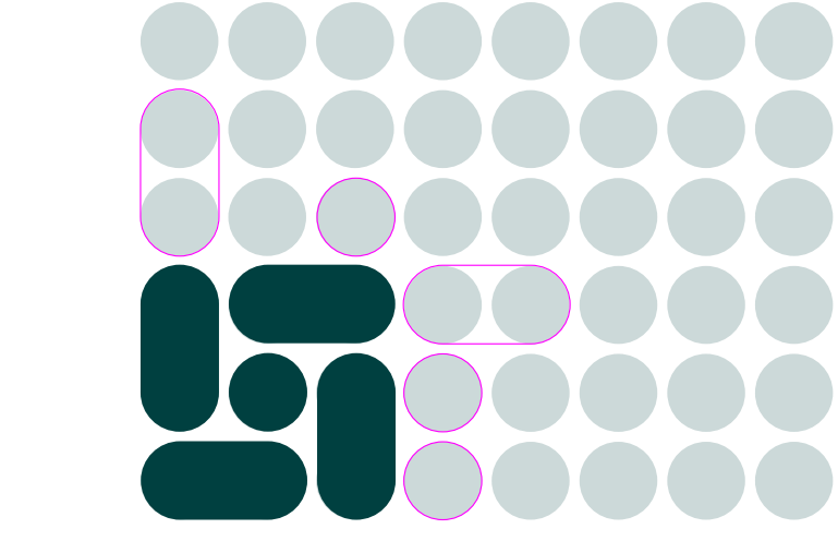
A combination of pill shapes and circles form the base of our logo, from which several unique patterns can form.
The power of narrative
Branding is important for a number of reasons. It allows a company to distinguish itself from its competitors, educate its customers, and carve out a place in the public’s consciousness. It’s the reason you can hum the Mc Donald’s jingle and associate a small, embroidered swoosh with Nike.
Our goal with CPHI’s rebrand was to cut through the noise, simplify our image and highlight our journey. We wanted to create a brand that is recognisable all over the world and reflects the growth we’ve experienced in the past two years.
‘Being able to talk about who we are, our journey - I think storytelling is a major part of that. And I think that's essential to today's business,’ Andersen says. ‘Storytelling is really a power for everybody. As an individual, as a company, as an organization and for us as a portfolio.’
Mavrommatis adds: ‘We're creating a brand that is going to speak for itself and for us, a brand that is strong and consistent across the world. That's what we're trying to achieve.’
As the world opens up and in-person events resume, we hope to emerge stronger than we were before, with a fully realised digital offering that supplements our core events business. Our goals haven’t changed – we remain committed to creating partnerships that will advance human health around the world - but we are doing so in a simpler, more accessible way.
Related News
-

News Women in Pharma: Hiring Across the Gender Divide
In our monthly series, we interview women from across the pharmaceutical industry and supply chain to discuss the importance of gender diversity in healthcare, the workplace, and beyond. -
.png)
Sponsored Content Ashwagandha and Herbal Medicines: Pharma’s Next Big Opportunity
Herbal medicines and nutraceuticals have seen a surge in interest since the onset of the COVID-19 pandemic. Driven by patient interest in prioritising personalised and integrative medicines, the herbal ingredients industry is now faced with concerns pe... -

News Identifying Alzheimer’s Disease biomarker proteins with whole blood tests
A University of Manchester spin-out pharmaceutical company, PharmaKure, has reported successful study results for the quantification of Alzheimer’s Disease biomarker proteins with a whole blood test. -
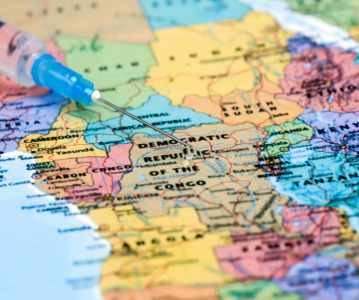
News Bill & Melinda Gates Foundation to boost mRNA vaccine initiatives in Africa with USD $40m
To address vaccine inequality and accessibility issues, the Bill & Melinda Gates Foundation aims to deliver USD $40m to various biotech companies and vaccine manufacturers in support of mRNA vaccine development. -
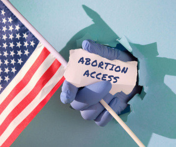
News Updated – Changing abortion pill access according to the US FDA and Supreme Court
After the approval of the medical abortion pill, mifepristone, by the US FDA, states across the USA approach the distribution of the pill differently, some ruling against allowing access to the drug. -
News Revolutionising cancer treatment with mRNA-based therapeutics
Global market for mRNA-based oncology therapeutics expected to reach USD $2 billion by 2029, with promising results for the combination of mRNA candidates with immune checkpoint inhibitors to treat solid tumours. -

News Breaking Barriers: Innovations in Oral Solid Dose Form Bioavailability
The effectiveness of a medication often hinges on its bioavailability – the rate and extent at which the active ingredient is absorbed into the bloodstream. When it comes to oral solid dose forms, such as tablets and capsules, the challenge lies ... -
News Choosing the Right CDMO Partner: A Comprehensive Guide
Finding the right partner for the development and manufacturing of your pharmaceutical or biopharmaceutical products is paramount. This is where Contract Development and Manufacturing Organizations (CDMOs) step in, offering their expertise and infrastr...
Position your company at the heart of the global Pharma industry with a CPHI Online membership
-
Your products and solutions visible to thousands of visitors within the largest Pharma marketplace
-
Generate high-quality, engaged leads for your business, all year round
-
Promote your business as the industry’s thought-leader by hosting your reports, brochures and videos within your profile
-
Your company’s profile boosted at all participating CPHI events
-
An easy-to-use platform with a detailed dashboard showing your leads and performance